A church needs Purpose, Vision, and Mission. As a local congregation it is imperative to find out why God put this particular group of people in this particular place at this particular point in time. On the national level our wider church, the United Church of Christ, needed a fresh start as well. Last fall the Board of Directors affirmed a new Purpose, Vision, and Mission statement for the denomination. If you haven’t seen them yet, here they are:
Purpose:
To love our God with all our heart, soul, mind and strength; and our neighbor as ourselves.
Vision:
United in Christ’s love, a just world for all.
Mission:
United in Spirit, inspired by God’s grace we welcome all, love all, and seek justice for all.
Beginning with General Synod 2017 in Baltimore this summer, the United Church of Christ will begin the transition to a new logo for the denomination. The logo, last re-designed in 2004, has been updated to reflect both tradition and innovation within the church as it faces the challenges and opportunities of Christian witness in the coming decades. The new logo’s design and colors are intended to complement the graphic representation of “A Just World for All,” developed to illustrate our new vision.
“I have been traveling around witnessing the work of our churches,” said the Rev. John C. Dorhauer, UCC General Minister and president, “and what we are doing will not change. What will change is our ability to tell the story more fully, and to narrate the impact of a mission we are all collectively engaged in. We are hoping to deepen the sense that we are all in this together; and that together we make a profound difference in our world.”
The new logo’s colors were chosen to work with both ‘A Just World for All’ and the ‘3 Great Loves campaign — Love of Children, Love of Neighbor, Love of Creation,’ which will be rolled out during General Synod in Baltimore (June 30 – July 4). Blue has replaced red, with black retained as the second color, in the new design, to visually and symbolically represent Creation elements of water and earth.
At St. John’s the phase-in of the new logo has already begun with a redesigned website, a new newsletter format, and updated worship PowerPoint slides.
The new logo retains an updated version of the traditional element of the UCC comma — a much-loved and widely used emblem of the United Church of Christ introduced as part of the “God is still speaking,” identity campaign. That campaign quoted a line from Gracie Allen that her husband George Burns found among her papers after death. In a letter addressed to him were the words, “George, never place a period where God places a comma.” A variation on that line, along with the graphic comma, has been used since 2004 as a symbol and shorthand way to refer to “continuing testimony,” or the ever-unfolding nature of God’s word for new times.
The new primary UCC logo consists of an updated comma emblem and the words “United Church of Christ.” “God is still speaking,” remains as the UCC’s tagline, and the new logo may be used with or without the tagline.
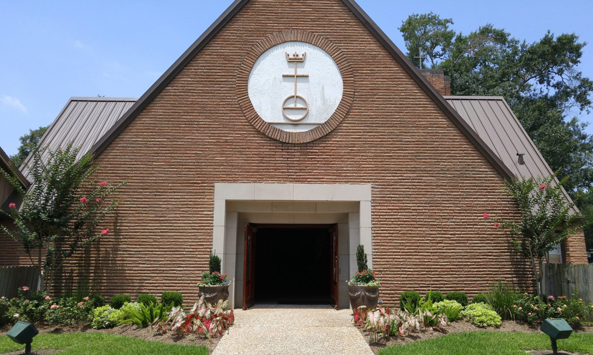
In addition to the comma, the UCC retains its original emblem for use by congregations and other entities of the denomination: the traditional “cross, crown, and orb” graphic, including the words “That they may all be one” (John17:21), which dates from the founding of the United Church of Christ in 1957—a statement of the UCC’s intent to be a “united and uniting” church.

